Harry 209
-
Posts
1,117 -
Joined
-
Last visited
Everything posted by Harry 209
-
In my opinion, it's the exact opposite of clean looking - the back is completely divided in two, the stripes on the sides don't match up, there's curved panels on the sides, the collar is in two parts and it's got a fake jagged edge to the stripes. Then you've got 'HOWAY THE LADS' written in a nasty font on the back. Add in the unfortunately unavoidable truncated three stripes on the shoulder and the blue details that are always a divisive element among fans and it looks a mess to me personally. For me the last two Castore efforts were clean looking designs.
-
Well it takes all sorts I suppose. For me that's Puma/late 2000s adidas tier.
-
Two magpies get in
-
But just like the original was, it will always be fondly remembered for being worn during our happiest season in most peoples memories.
-
I do wonder whether the club or the manufacturers do market research on these kits - is it possible that loads of fans have been consulted and gave positive feedback on this design? If so who are they asking? And if not, why not? I haven't seen much positive feedback on this design from any channel. It's just so random.
-
Come back Puma/Castore all is forgiven.....
-
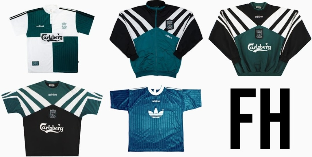
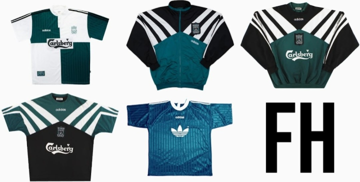
Liverpool getting all this remake stuff next season! If they gives us the same treatment maybe we'll get the 96 away along with the burgundy training stuff.
-
What would happen if we finish on same GD and same goals scored as Chelsea? Head to head is exactly even.
-
Apologies if this has been covered before but am i right in saying we can't finish any lower than 6th barring a 0-3 defeat on Saturday?
-
If we can believe what was said in this evenings workshop then I expect the badge will look.like this with a simplified scroll underneath with bolder letters:
-
Carol and Dawnie pretending to give a f*ck about Zunderland on Look North there....you know as soon as the cameras are off they are slagging them off.
-
I actually quite like that! Definitely the best of a bad bunch, at the very least.
-
Yes, it's in Premier League rules that every club can display a charity sponsor once every season.
-
I wonder if we'll have a charity sponsor on the last day of the season? Would be a bit mean of the club if they didn't take that opportunity.
-
I hope they don't go with a magpie on the new badge. I wont be able to wear it. I can wear this seasons 3rd shirt because it has two magpies on it. If I want to wear an early 80s Umbro shirt, I would have to wear the shorts as well to ensure there is a second magpie present. Hopefully I'll be able to get this across to the powers that be tomorrow.
-
A Marra-chute payment in fact
-
Zunderland have won a game, now someone called MadMackem10 on RTG is pondering a transfer for Joe Bellingham to MADRID!
-
I'm hoping there will be some cracking adidas Originals next season to make up for that.
-
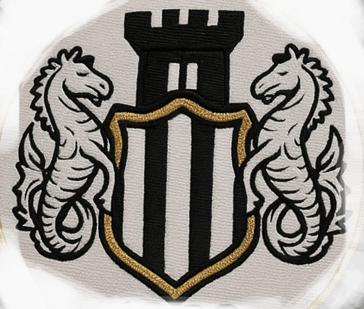
surely that cant be genuine? It doesn't fit in with what they are telling us - the ribbon is MORE complicated than the old one!
-
Reading the announcement I think it's going to be a simplification of the current badge rather than a completely new design. I'm not sure how you go about simplifying it tho - less detail on the seahorses? No scroll? No gilt edge on the shield?
-
The ones with the chriss cross background are always fakes.
-
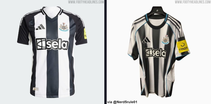
Seeing them side by side makes me appreciate how actually great the old one is:
-
Long sleeves tho