Geordie Boyo
-
Posts
1,037 -
Joined
-
Last visited
Everything posted by Geordie Boyo
-
-
That’s what I was thinking with the armchair doilies & maxi pad on the collar…!
-
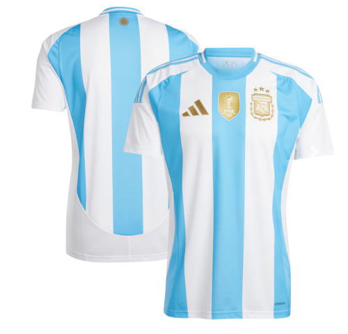
I’d be happy with that. I think with the white stripe in the middle it seems to stand out more. Maybe it’s because it reminds me of the 96 jersey in that way.
-
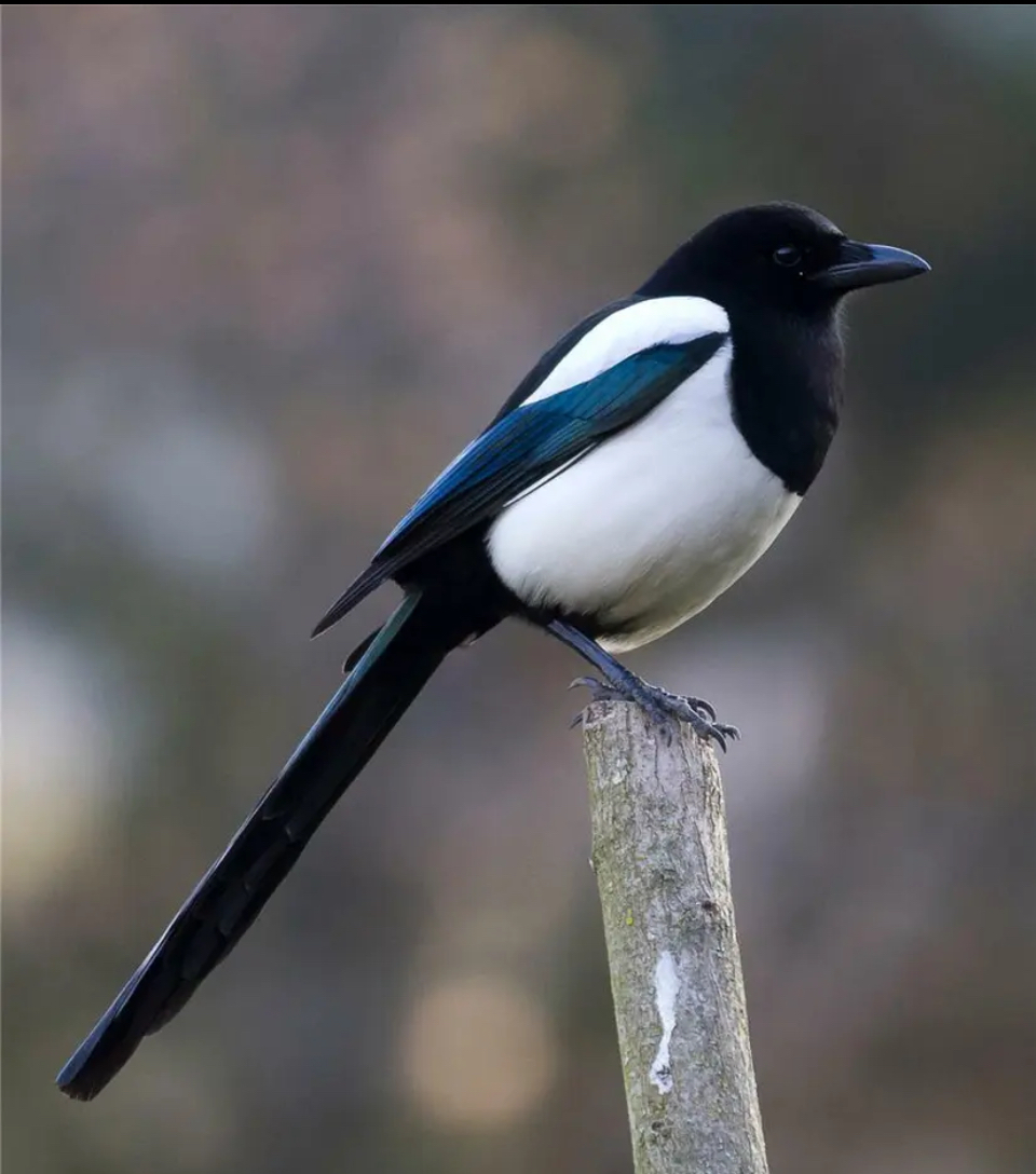
So definitely nothing resembling magpie wings then. Good, good
-
First image that comes to mind is Jamie McClen when I see that strip. he wasn’t very tall like.

-
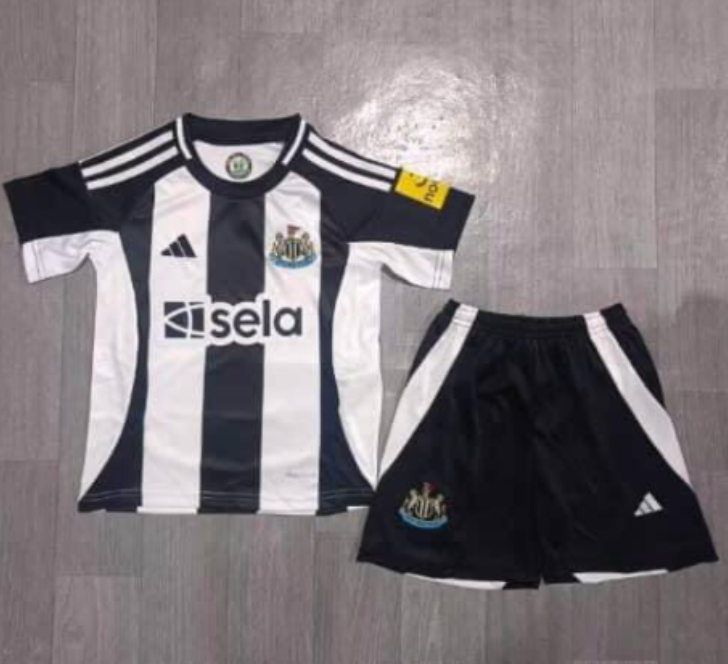
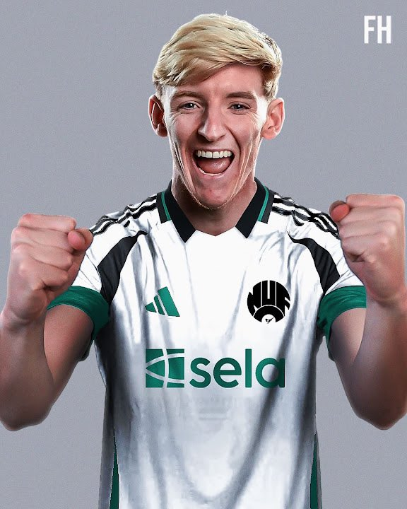
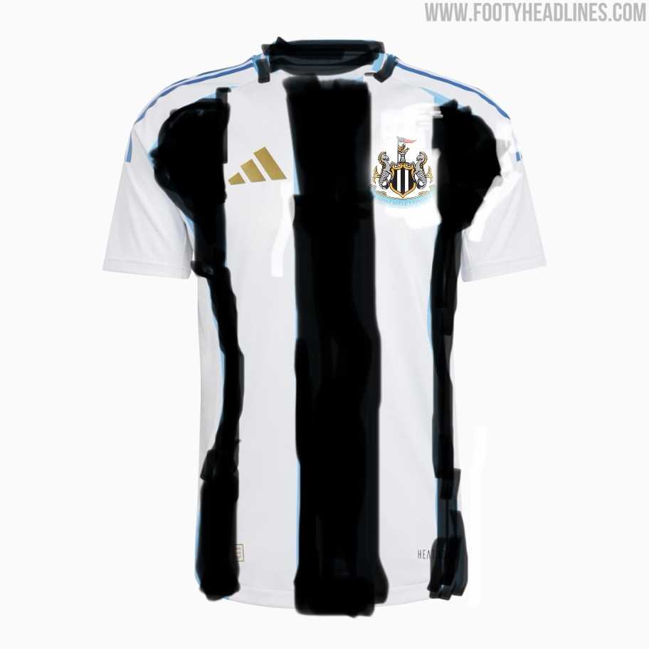
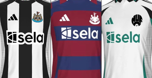
Hope it’s not it, but chances are it seems legit….after all the hype from the fella who participated in the design doesn’t look like anything special. i don’t know if the curves are just meant to be in reference to how it looks on a magpies wing….but just prefer black and white stripes and nothing else - plain black shorts and either plain black socks with or without white cuff.

-
It’s canny man. You’re always gonna get people saying he should have went here or there, etc……which he should have…….but the point is it’s not the worse I’ve seen and he’s just showing what it means for him to be playing for the team he supports.
-
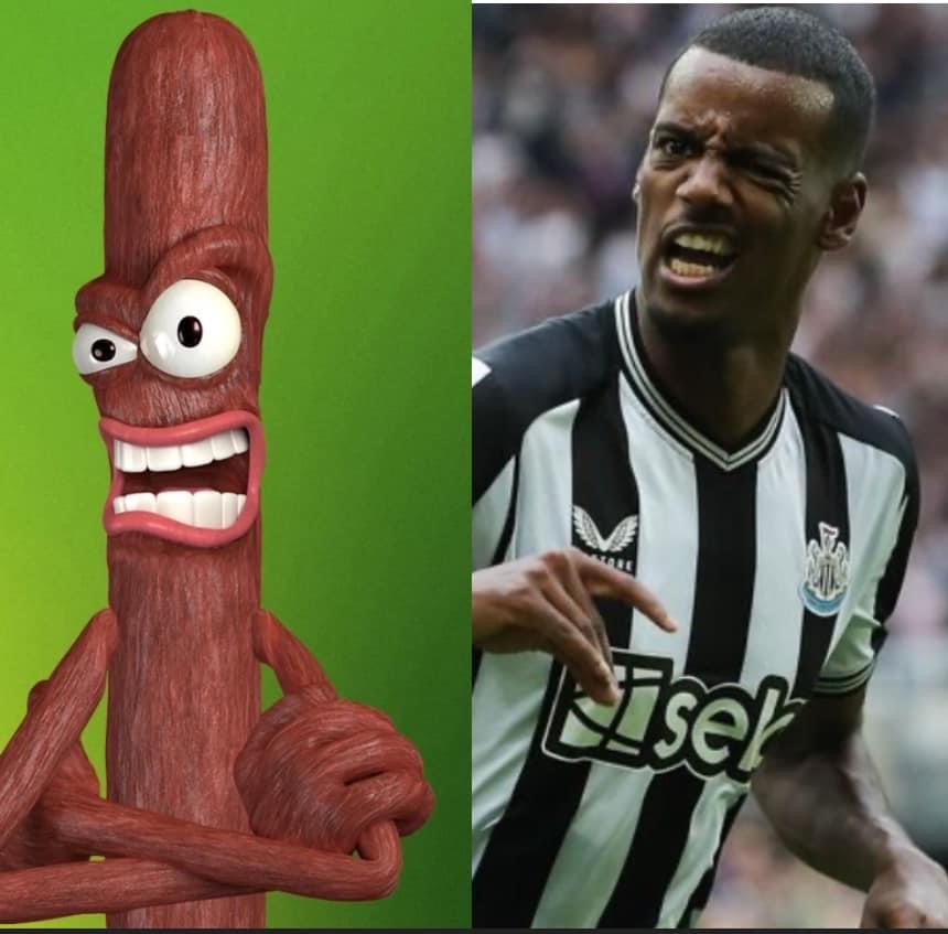
I’m not sure what’s worse. That or Tonali…! Mind, I’ve made mistakes with Moonpig for wor’ lass forgetting to edit the template name, but thats a pisstake like.
-
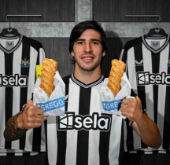
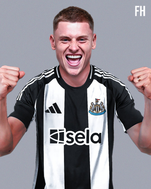
I'm definitely getting no name on the back this time around……
-
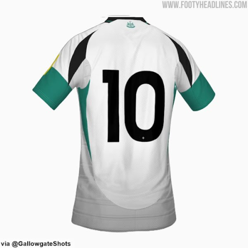
https://x.com/footy_headlines/status/1784369464428970163?s=46


-
Hopefully justice will be done.
-
Other two should be accurate then
-
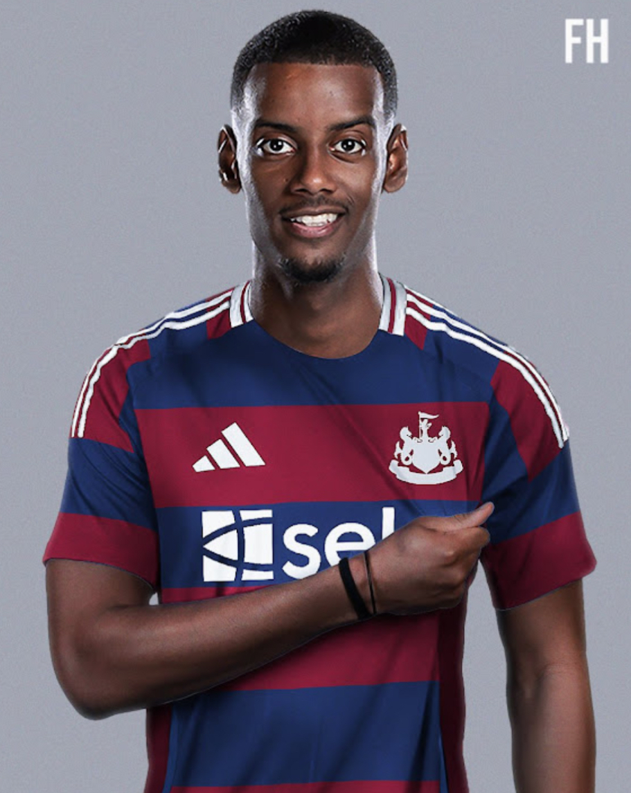
I agree - I had a picture in my mind, but couldn’t be arsed to check if it was that one I was talking about or not, but you’re right. That’s the one. When you had the likes of Robert, shearer, dyer and Bellamy under wor Bobby in the champions league, so I can see why they would go for that design.
-
I mean, it’s not bad - similar look to the one when Ba & Cisse played, but plain black & white stripes without any patching - especially the big patch on the back, would have been perfect.
-
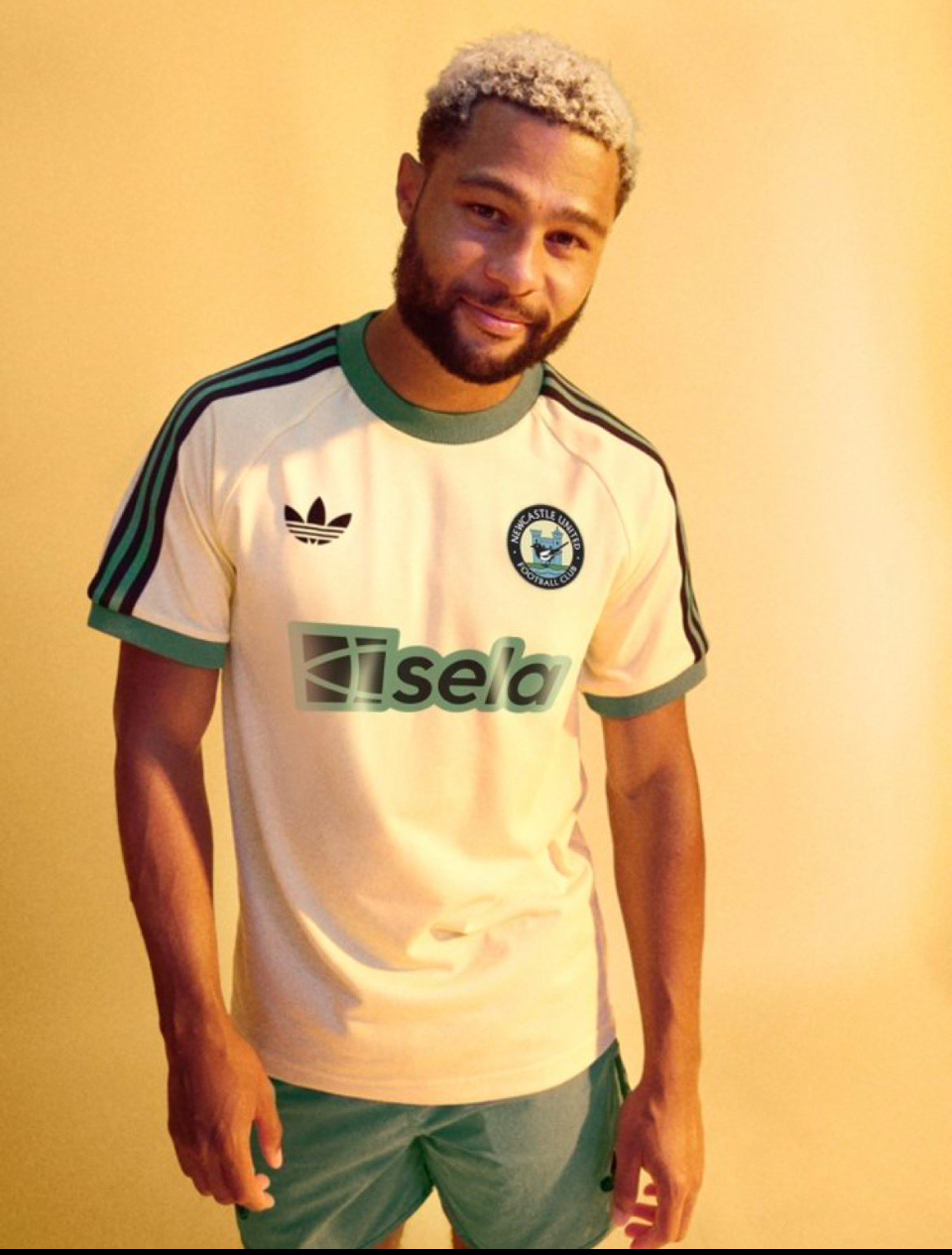
I do think it looks better, but I’d just be happy if the stripes don’t have patching and other dodgy colours on it.
-
I honestly share the same view - I just thought if it was possible to top me last shit post and I think I might have did it.
-
I’d already posted an exclusive of this on page 564, so old news really…..
-
https://x.com/caseysean51/status/1776261393353769421?s=46

-
https://x.com/nufcgallowgate/status/1775563116719260118?s=46

-
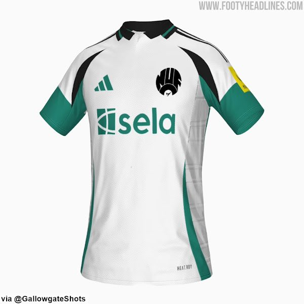
They’ve done this a couple times where they try to mix a couple of designs together from times when we played well and it just looks shit. traditional black and white stripes with no patching - works every time. Make the stripes bigger or smaller alternate where the colours are. Anything else looks cheap.
-
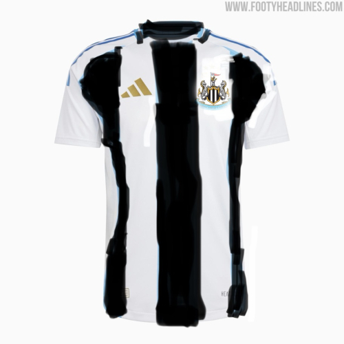
footyheadlines.com exclusive. It’s just a shit screenshot
-
Exclusive *spoiler alert* there ya go.
-
Fucking hate them all that work done by forest undone by extra goal time for the twats.
-
Arsenal vs. Newcastle United: 24/2/24 @ 20:00 (TNT Sports)
Geordie Boyo replied to HaydnNUFC's topic in Football
Not sure how I feel about this one. Win our last two away games - Villa being a big win. Great to potentially have isak and Willock back , but a tough place to get any points unless we’re gonna press them, take our chances & pull together to close them down.