-
Posts
19,240 -
Joined
-
Last visited
Everything posted by gdm
-
-
Totally agree. Sakamoto was causing Sunderland lots of problems.
-
yeah, my personal feelings are that it’s either strongly based off the current badge or we use one of the older badges. All the new designs I’ve seen people doing just look really shit and just aren’t Newcastle United to me.
-
I’d even buy that 2nd one.
-
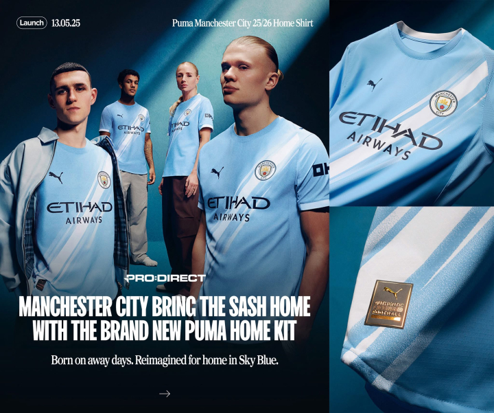
Man City’s new one is so much better than their previous one.
-
It’s like a cartoon version of the real one
-
the irony. John Terry famously turned up in full kit and shin pads when he was out injured.
-
I got an email. they don’t miss a trick. Making the crest in the bottom left look pixelated and hard to make out
-
Shit source but would it surprise anyone ?
-
Hope Bournemouth get relegated next season
-
It’s ok Jebbison is on
-
He’s been the worst player on the park
-
Bournemouth goal is coming
-
Bournemouth don’t look like scoring. Fuckin dreadful
-
Mon tae fuck Bournemouth
-
We need 6 points anyway we can’t be concerned what other teams do if we don’t get our job done
-
He’s not wrong. I’ve already seen enough terrible reimagining’s of the crest to last me a life time
-
Plus we already have a bar in their ground
-
Not a fan of these coming up at all but god they are shite.
-
Had a quick look at the crest history of both Aston Villa & Man City and their current crests are very similar to their old crests in the 70s, 80s & 90s. I also noticed both clubs have changed their crests a lot of times
-
by the sounds of it circular is better so I’d imagine the shape of the seahorses and scroll isn’t ideal.


