NE27
-
Posts
4,558 -
Joined
-
Last visited
-
That adidas logo on the reverse of the shirts is properely jarring as well for some reason! A true disaster class from Adidas on the home kit for me, it's not like it's even that interesting or zany a design. It's just plain shite
-
Howe's cut his holiday short it seems.
-
-
Great player on his day for us but became very obvious this season he was angling for a move upwards. Thanks for your efforts and hopefully we can extract as much as possible. Feels like Gordon may have at least gave us the heads up in advance.
-
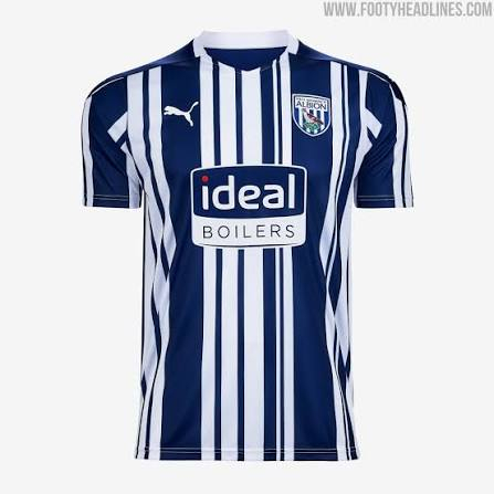
Too derivative. But honestly, even if it was fully striped the shirt is a firm no for me. I get they want to stray away from same old every season but I personally think it looks shite and I've never liked the lighter blue accents they persist with.
-
Also just realised it has a blank back again
-
Looks like this, which I don't like...
-
I'm struggling to recall an easier fucking goal in my life
-
Stunningly retarded by Everton tbh
-
What the fuck are Everton man
-
Has anyone made comment on the reverse of the shirt? Do you know if it is a white box again () or the same pattern carried around the back? @Shadow Puppets can you divulge that?
-
It's shit but it's the way we need to operate if we can't twist the players hand in discussions. We need it to be open and honest then be ready to deal with an upper hand where we can because that isak situation cannot happen again. Obviously the above situation may have been nufc, and we just wouldn't take no for an answer and eventually it got played out in public making it an absolute clip in the end.