All Activity
- Past hour
-

General NUFC stuff: club crest to be changed (Official)
Zero replied to LoveItIfWeBeatU's topic in Football
This won’t end well. Its just impossible to design a new crest that everyone associated would be satisfied. -

General NUFC stuff: club crest to be changed (Official)
St1pe replied to LoveItIfWeBeatU's topic in Football
100% this. For the actual benefit I don’t know why you’d piss people off. -
General NUFC stuff: club crest to be changed (Official)
Crimson Cardigan replied to LoveItIfWeBeatU's topic in Football
I both like the current crest and have no issue with it being modified in a tasteful, clever way. I actually enjoy a lot of bold, modern design (wolves was excellent) but this feels like it’s going to be very minimal indeed, so hopefully everyone can be equally unhappy with the result. -

General NUFC stuff: club crest to be changed (Official)
AyeDubbleYoo replied to LoveItIfWeBeatU's topic in Football
I’d expect like remove the name, maybe remove the lion and flag, simplify the other parts and maybe reshape it somehow into a shield or circle. Seahorse tongues back in their gobs. There are probably loads of examples on the internet already. -
General NUFC stuff: club crest to be changed (Official)
Gottlob replied to LoveItIfWeBeatU's topic in Football
Probably be the Saudi scabbards underneath an image of the tree that was felled from the Sycamore Gap. -
General NUFC stuff: club crest to be changed (Official)
SUPERTOON replied to LoveItIfWeBeatU's topic in Football
I’m not against it or anything, I just don’t get the point. Does a badge really make any difference? -

General NUFC stuff: club crest to be changed (Official)
Kid Icarus replied to LoveItIfWeBeatU's topic in Football
It's bullshit like. The consultation should be on whether it changes, not what it changes to. I wouldn't mind at all if it was a clean up - the current badge does have accessibility and digital recreation issues, but more often than not I think those issues are either nonsense (not in our case) and/or used as an excuse to make massive changes that everyone hates. -

General NUFC stuff: club crest to be changed (Official)
The Butcher replied to LoveItIfWeBeatU's topic in Football
Fuck right off. -
General NUFC stuff: club crest to be changed (Official)
AyeDubbleYoo replied to LoveItIfWeBeatU's topic in Football
It ‘sounds’ like they have a good understanding of what we will accept and/or hate. So it will be a challenge for the designers to achieve the objective without making it too far removed for people to like. -
General NUFC stuff: club crest to be changed (Official)
Turnbull2000 replied to LoveItIfWeBeatU's topic in Football
Heard they're taking inspiration from this -
General NUFC stuff: club crest to be changed (Official)
Ben replied to LoveItIfWeBeatU's topic in Football
TBF I never liked those Seahorses sticking their tongues out -
General NUFC stuff: club crest to be changed (Official)
Dr.Spaceman replied to LoveItIfWeBeatU's topic in Football
Just done the survey and my feedback was to avoid something like what Juve currently have. I want them to incorporate as much as possible from the current crest but not fussed if they do away with the ribbon. -

General NUFC stuff: club crest to be changed (Official)
Nine replied to LoveItIfWeBeatU's topic in Football
Shit storm incoming -

General NUFC stuff: club crest to be changed (Official)
sushimonster85 replied to LoveItIfWeBeatU's topic in Football
Shocked it's taken them this long. Obviously would prefer they didn't, especially now we have won something with this badge. That being said, I do undertand why older football badges/crests are a nightmare from a branding perspective. Just hope they don't get too daft with it. And they clock on there can't be a hint of green anywhere, or the world of football journalism will be in uproar. -

General NUFC stuff: club crest to be changed (Official)
JT24 replied to LoveItIfWeBeatU's topic in Football
Happy to hear ‘em out. Don’t mind change. -
General NUFC stuff: club crest to be changed (Official)
AyeDubbleYoo replied to LoveItIfWeBeatU's topic in Football
Well you’ve answered your own question there. Of course you can literally render any image digitally, the question is does it look good and work well. -
General NUFC stuff: club crest to be changed (Official)
Dr.Spaceman replied to LoveItIfWeBeatU's topic in Football
Norwich too -
General NUFC stuff: club crest to be changed (Official)
Bizza replied to LoveItIfWeBeatU's topic in Football
-

General NUFC stuff: club crest to be changed (Official)
TBG replied to LoveItIfWeBeatU's topic in Football
See reaction to the new shirt aka worst shirt ever announce new crest new shirt becomes instant retro classic ??????????? Profit -

General NUFC stuff: club crest to be changed (Official)
HaydnNUFC replied to LoveItIfWeBeatU's topic in Football
And a few clubs whose crests have 'changed' have just had font or something tiny updated such as Leicester, Watford, Man Utd, Southampton and Bournemouth from the top of my head. -

General NUFC stuff: club crest to be changed (Official)
GeordieDazzler replied to LoveItIfWeBeatU's topic in Football
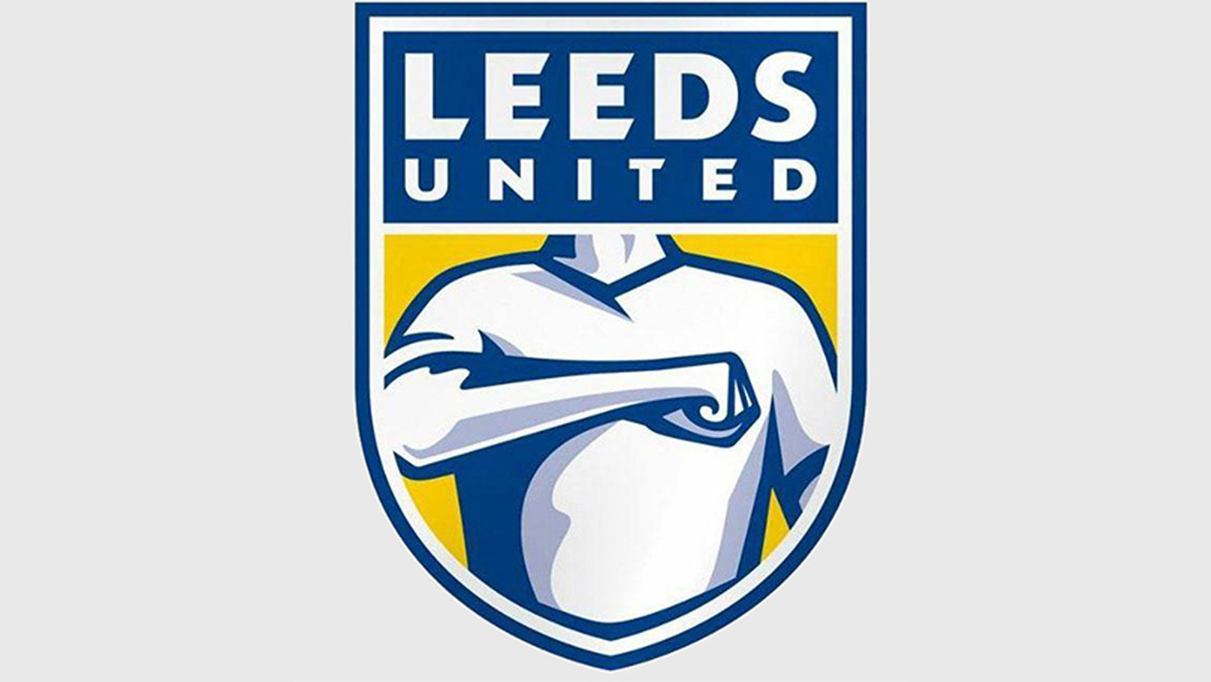
Will be going some to top this classic missstep from Leeds
-
General NUFC stuff: club crest to be changed (Official)
Kid Icarus replied to LoveItIfWeBeatU's topic in Football
Or fuck off tbh
-
General NUFC stuff: club crest to be changed (Official)
ponsaelius replied to LoveItIfWeBeatU's topic in Football
I always think the idea that they're difficult to replicate digitally is a load of bollocks. It's just a vector image that can be recreated at any size or shape and used for any purpose. What this usually actually means is they want something simple, with a basic shape, bold colours and that is more recognisable as a corporate brand rather than something which represents the civic identity of the place (as our current badge does being taken largely from the historic coat of arms). I don't have any issue with badges changing necessarily, but the current trend is IMO that the vast majority contemporary badges at all levels of football are downgrades. -

General NUFC stuff: club crest to be changed (Official)
PauloGeordio replied to LoveItIfWeBeatU's topic in Football
I’m sure it will be a professional job and not some tacky looking thing. Love the current badge and I’m curious to see the new one. -
General NUFC stuff: club crest to be changed (Official)
Turnbull2000 replied to LoveItIfWeBeatU's topic in Football
To go with our generic circular new stadium. Guess I need to move with the times.